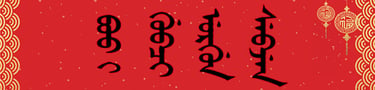
Why Is Manchu Script Written Vertically? Origins and Rules
Learn why Manchu script is written vertically from top to bottom, how it inherited Mongolian writing conventions, and how this shapes traditional calligraphy.
MING YE
11/19/20266 min read
Why Is the Manchu Script Written Vertically from Top to Bottom?
Direct Answer: Manchu script is written vertically from top to bottom because it inherited its orientation and connected letter structure from traditional Mongolian writing, which developed from the Old Uyghur script. Its columns advance from left to right. This historical arrangement governs Manchu letter formation, Qing dynasty manuscript layouts, modern digital typography, and traditional handwritten calligraphy.
By Ming Ye (Yehenara Yulin), Manchu Language Researcher & National First-Class Calligrapher
1. The Historical Origins of Vertical Manchu Writing
The writing direction of Manchu can be traced through several successive writing systems: Aramaic, Sogdian, Old Uyghur, traditional Mongolian, and eventually Manchu. This lineage explains why Manchu differs structurally from both Chinese and European alphabets.
Sogdian writing traditionally progressed horizontally from right to left. During the development of Old Uyghur writing, the inherited horizontal arrangement became vertical. Geometrically, this transformation can be understood as a 90-degree counterclockwise rotation: a right-to-left horizontal line becomes a downward vertical column, while successive lines advance toward the right.
This model explains the spatial relationship between the scripts, although the historical development of vertical writing was gradual rather than necessarily the result of a single deliberate rotation.
Traditional Mongolian inherited this arrangement. In 1599, Nurhaci commissioned Erdeni and Gagai to adapt Mongolian writing for the Manchu language. Their adaptation retained the vertical axis, connected letterforms, and left-to-right column progression.
The reforms associated with Dahai in 1632 introduced more systematic distinctions between letters through dots and circles. These changes improved orthographic precision while preserving the established direction of writing.
Consequently, vertical orientation was already embedded in Manchu before its mature alphabet emerged. Readers interested in this historical development can explore related materials in the Manchu Culture Encyclopedia.
2. Why Manchu Columns Move from Left to Right
A distinction must be made between the direction of writing within an individual column and the direction in which successive columns are arranged.
Manchu words are written downward. Once a column is completed, the writer begins the next column to its right.
Traditional Chinese follows a different convention: characters descend vertically, but successive columns advance from right to left.
Writing systemDirection within a lineSequence of linesLetter structureHistorical SogdianRight to leftTop to bottomOften connectedVertical Old UyghurTop to bottomLeft to rightConnectedTraditional MongolianTop to bottomLeft to rightConnectedTraditional ManchuTop to bottomLeft to rightConnectedTraditional ChineseTop to bottomRight to leftIndividual charactersModern EnglishLeft to rightTop to bottomGenerally separate
The contrasting directions of Manchu and Chinese created distinctive opportunities for bilingual composition during the Qing dynasty.
Palace plaques, imperial inscriptions, and official documents frequently incorporated both scripts. In some bilingual layouts, their opposing column directions could be accommodated through arrangements progressing toward a central axis.
Such compositions required careful coordination rather than simply placing equivalent translations beside each other. The orientation, length, and visual density of each inscription determined its position within the available space.
Surviving architectural inscriptions at the Forbidden City in Beijing and the Shenyang Imperial Palace provide material evidence of these multilingual design traditions, although individual plaque arrangements vary.
[Suggested Image: Historical bilingual Manchu–Chinese palace plaque from picture.manchuculture.net | Alt Text: Qing dynasty bilingual palace plaque showing traditional vertical Manchu and Chinese inscriptions]
3. How Vertical Orientation Determines Manchu Letterforms
Manchu is a connected alphabet in which many letters take different forms according to their position within a word. These are commonly classified as initial, medial, final, and, where applicable, isolated forms.
An initial letter establishes the beginning of the connected sequence. Medial letters continue the vertical structure, while final letters terminate it. Particular shapes also depend on neighboring letters and established spelling conventions.
The vertical axis therefore functions as the organizing framework of an entire word.
Dots, circles, hooks, and curved strokes occupy defined positions relative to this axis. Their placement conveys linguistic information rather than serving merely as ornament.
A misplaced distinguishing mark can alter the identity of a letter, while an incorrect connection may produce an irregular or ambiguous written form.
The Manwen Laodang (满文老档), or Old Manchu Archives, preserves extensive examples of early Qing administrative writing. Its manuscripts reveal how connected words, column spacing, and orthographic conventions operated in practical documentary contexts.
Imperial dictionaries, including the Yuzhi Qingwen Jian (御制清文鉴), further demonstrate the relationship between standardized vocabulary and written structure.
Modern learners can compare complete words through the online Manchu dictionary, examining how individual letters behave within connected sequences.
Understanding this relationship is essential because Manchu literacy depends on recognizing complete letter structures rather than memorizing isolated graphical symbols alone.
4. Can Manchu Be Written Horizontally in Modern Digital Environments?
Modern technology allows Manchu to appear in horizontal environments through romanization or the rotation of traditional glyphs.
The transcription system associated with Paul Georg von Möllendorff, described in his 1892 publication A Manchu Grammar, represents Manchu using Latin letters. Forms such as a, e, i, o, u, and ū can therefore appear within horizontally arranged academic publications.
Displaying the original script digitally is more complex.
Manchu characters are encoded primarily within the Unicode Mongolian block, covering U+1800–U+18AF. Unicode identifies characters and provides mechanisms for controlling certain contextual variants, while compatible fonts and shaping engines determine their displayed forms.
OpenType contextual substitution and positioning are particularly relevant to maintaining correct letter connections.
Web developers can establish the traditional column direction through the CSS property writing-mode: vertical-lr, which arranges vertical lines in a left-to-right sequence.
However, correct CSS orientation alone cannot repair defective glyph shaping. A suitable font, compatible rendering engine, and properly encoded text must work together.
These requirements explain why Manchu may appear disconnected or incorrectly formed in some applications.
Digital typography provides valuable infrastructure for electronic dictionaries, searchable archives, and educational resources. Romanization also makes Manchu accessible to researchers working across different languages. For traditional manuscripts, formal inscriptions, and calligraphic artwork, the original vertical presentation remains the established convention.
5. Vertical Composition in Traditional Manchu Calligraphy
In my practice as a Manchu calligrapher and language researcher, I regard vertical orientation as the foundation of both orthographic accuracy and artistic composition.
A handwritten Manchu word develops through changes in brush pressure, stroke tension, ink distribution, and the continuous downward movement of the writing instrument.
The calligrapher must maintain accurate connections while controlling the relative proportions of letters. Dots and circles require particular attention because their visual placement must preserve their linguistic function.
When several columns form a composition, their different lengths influence the distribution of empty space. A shorter word may require adjustments in spacing or positioning to establish balance with neighboring inscriptions.
These decisions become especially demanding in Manchu–Chinese bilingual calligraphy, where two fundamentally different writing structures must coexist within one artwork.
Digital fonts can reproduce conventional letterforms and provide reliable tools for publication. Their predefined outlines, however, cannot fully reproduce the individual brush movement, ink penetration, and expressive decisions of an original handwritten work.
Machine translation likewise requires linguistic verification before its output can become an authentic inscription.
The finest traditional compositions preserve the structural discipline of the Manchu alphabet while allowing the artist's individual brushwork to remain visible. Historical and contemporary examples can be explored through the Manchu visual and photographic archive.
[Suggested Image: Original handwritten vertical Manchu calligraphy scroll from picture.manchuculture.net | Alt Text: Traditional handwritten Manchu calligraphy demonstrating connected vertical strokes, brush pressure, ink rhythm, and balanced column spacing]
Frequently Asked Questions
Is Manchu written vertically in the same direction as Chinese?
Both traditional Manchu and Chinese are written from top to bottom, but their column arrangements differ. Manchu columns advance from left to right, whereas traditional Chinese columns advance from right to left. This distinction influences manuscript organization, architectural inscriptions, and bilingual calligraphic compositions throughout Qing material culture.
Why is Manchu written vertically instead of horizontally like English?
Manchu inherited its vertical orientation from traditional Mongolian script, which developed from Old Uyghur writing. Its connected letterforms and positional variants evolved within this inherited system. English uses a different alphabetic tradition, in which horizontal left-to-right writing provides the conventional framework for arranging letters and words.
Can Unicode display traditional vertical Manchu correctly?
Yes. Unicode supports Manchu through characters encoded primarily in the Mongolian block, U+1800–U+18AF. Correct display also requires compatible fonts, contextual shaping engines, and appropriate vertical layout settings. On websites, CSS writing-mode: vertical-lr establishes the traditional column direction, provided the underlying text is correctly rendered.
Is handwritten vertical Manchu calligraphy different from printed Manchu?
Both follow the same fundamental orthographic conventions. Handwritten calligraphy introduces variations in brush pressure, stroke thickness, ink rhythm, and spatial composition. Printed and digital forms emphasize reproducibility, while original calligraphy preserves the physical execution and individual artistic decisions of the calligrapher within the traditional vertical structure.
References and Research Materials
Möllendorff, Paul Georg von. A Manchu Grammar. 1892.
Gorelova, Liliya M. Manchu Grammar. Brill, 2002.
Li, Gertraude Roth. Manchu: A Textbook for Reading Documents. 2000.
Daniels, Peter T., and William Bright, eds. The World's Writing Systems. Oxford University Press, 1996.
Manwen Laodang (满文老档). Early Manchu archival records.
Yuzhi Qingwen Jian (御制清文鉴). Qing imperial Manchu dictionary, first compiled in 1708.
Unicode Consortium. The Unicode Standard, Mongolian script documentation and contextual character representation.
If you are looking to commission authentic, hand-written Manchu or Manchu-Chinese bilingual calligraphy, explore the custom collection and commissioning services by Yehenara Yulin.