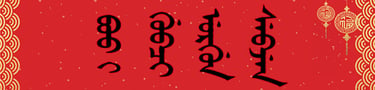
Why Does the Manchu Script Look So Unusual and Beautiful?
Why does Manchu script look so distinctive? Explore its vertical writing, connected letters, dots and circles, calligraphy, and unique visual appeal.
10/28/20268 min read
Why Does the Manchu Script Look So Unusual to People Seeing It for the First Time?
Exploring the Unique Visual Beauty, Vertical Structure, Connected Letters, and Artistic Character of Manchu Writing
By MING YE
Why do many people find the Manchu script unusual, beautiful, or mysterious when they encounter it for the first time?
Even without understanding a single Manchu word, viewers may notice that the writing looks very different from Chinese characters, English letters, or other familiar scripts.
Its long vertical lines, connected letter forms, delicate curves, and distinctive dots and circles create an immediately recognizable visual appearance.
Some people compare it to hanging ribbons, flowing water, or decorative patterns.
Others initially mistake it for an unfamiliar form of Mongolian, Arabic, or ornamental calligraphy.
The Manchu script often attracts attention because its visual structure differs significantly from the writing systems most people encounter in everyday life.
Unlike Chinese characters, which are traditionally organized within relatively compact square-shaped units, Manchu letters connect along a vertical axis.
Unlike English, which is normally written horizontally from left to right, traditional Manchu is written vertically, with columns progressing from left to right.
These characteristics create a distinctive rhythm and composition.
However, the impression of unusual beauty is not universal. It depends on a viewer's cultural background, familiarity with different writing systems, and personal aesthetic preferences.
To understand why Manchu can make such a strong first impression, it is useful to examine its structure, historical development, and artistic qualities.
1. Its Vertical Writing Direction Immediately Attracts Attention
One of the most noticeable characteristics of traditional Manchu is its writing direction.
Manchu is written from top to bottom, with successive columns arranged from left to right.
This differs from the horizontal arrangement of modern English and most contemporary Chinese text.
It also differs from traditional vertical Chinese, whose columns generally progress from right to left.
For readers accustomed to horizontal writing, the vertical arrangement of Manchu can appear unfamiliar.
The eye follows a continuous downward movement rather than moving across a horizontal line.
This creates a different visual experience.
A page of Manchu writing often contains numerous parallel vertical sequences.
These sequences may resemble hanging threads or flowing lines.
The effect becomes especially noticeable in long passages, where the repeated vertical structures create a strong sense of rhythm.
However, vertical writing is not unique to Manchu.
Traditional Mongolian and several related writing traditions also use vertical arrangements.
The distinctive appearance of Manchu results from the combination of vertical direction with its particular letter forms and orthographic conventions.
2. Manchu Letters Connect Like a Continuous Line
Another striking feature is the way Manchu letters connect.
In ordinary English printing, individual letters are usually visually separated, even when they belong to the same word.
Chinese characters are also generally presented as distinct units.
Manchu works differently.
Its letters connect along a vertical axis, forming continuous written sequences.
Many characters change shape depending on their position within a word.
A letter may have an initial, medial, or final form.
The visual appearance of the complete word therefore emerges from the relationship between its letters.
This connected structure can make Manchu appear more fluid than writing systems based primarily on separate character blocks.
For someone unfamiliar with the script, the boundaries between individual letters may not be immediately obvious.
The viewer may perceive an entire word as one continuous visual form.
This creates an interesting contrast between linguistic structure and visual impression.
A Manchu word consists of identifiable written elements, but those elements are integrated into a connected composition.
What appears to a beginner as a single decorative line is actually an organized sequence of linguistic signs.
3. Dots and Circles Give Manchu Its Distinctive Appearance
Dots and circles are among the most recognizable features of standard Manchu writing.
Their historical importance is closely connected with the development of the script.
In 1599, Nurhaci ordered the creation of a writing system for the Manchu language.
The early script was adapted from traditional Mongolian writing.
In 1632, during the reign of Hong Taiji, Dahai introduced important modifications traditionally associated with the addition of dots and circles.
These changes helped distinguish sounds that could otherwise be difficult to identify in the earlier system.
The reformed script became known as tongki fuka sindaha hergen, commonly understood as the script with dots and circles.
These marks were not introduced merely for decoration.
They served linguistic purposes.
Nevertheless, they also contributed to the distinctive visual character of Manchu writing.
The combination of long vertical strokes, curved connections, dots, and circles produces a complex but organized appearance.
To an unfamiliar viewer, these small marks may seem ornamental.
In reality, they are meaningful components of the writing system.
This distinction is important because the beauty of Manchu emerges partly from features that also serve practical linguistic functions.
4. Manchu Looks Different from Chinese Calligraphy
Manchu and Chinese calligraphy developed within overlapping historical and cultural environments, particularly during the Qing dynasty.
However, their visual structures differ substantially.
Chinese characters are traditionally organized around relatively compact character units.
Calligraphers explore the balance of strokes within and between these units.
Manchu uses connected vertical letter sequences.
Its composition depends on the relationships between individual letter forms, their connections, and the spacing of words and columns.
These structural differences create different artistic possibilities.
Chinese calligraphy may emphasize the internal balance of individual characters.
Manchu calligraphy often places particular importance on the continuity of vertical lines and the rhythm created by connected forms.
This does not mean that one writing system is more artistic or expressive than the other.
Rather, their visual structures provide different foundations for artistic development.
A person familiar with Chinese calligraphy may find Manchu especially interesting because it offers a different relationship between line, space, and written meaning.
The contrast becomes particularly noticeable when Manchu and Chinese appear together in bilingual inscriptions or historical documents.
Such combinations reveal two distinct approaches to organizing written language on the page.
5. The Script Can Look Like an Artistic Pattern Even Before It Is Read
When people encounter an unfamiliar writing system, they often notice its overall visual structure before recognizing individual letters.
This is especially relevant to Manchu.
A reader unfamiliar with Manchu may initially perceive the script as a collection of connected shapes rather than as ordinary language.
The repeated vertical lines, curves, and small distinguishing marks can create an impression of ornamentation.
This does not mean that Manchu is inherently decorative.
It is a functional writing system developed to represent a spoken language.
Its letters follow linguistic and orthographic rules.
However, the visual characteristics of those rules can produce an aesthetic effect.
This is one reason why Manchu can attract attention in exhibitions, museums, calligraphic works, and cultural publications.
Viewers may appreciate the appearance of the writing before understanding its meaning.
The same phenomenon can occur with other unfamiliar scripts.
Arabic calligraphy, Tibetan writing, Georgian letters, and traditional Mongolian script may also appear visually striking to people who have not previously encountered them.
The effect is therefore partly a matter of unfamiliarity.
Nevertheless, Manchu has its own distinctive combination of vertical composition, connected forms, and orthographic marks.
6. Manchu Calligraphy Makes Its Visual Qualities More Noticeable
The visual appeal of Manchu becomes especially apparent when the script is used in calligraphy.
Ordinary handwriting and artistic calligraphy are not identical.
In everyday writing, the principal objective is usually to communicate information clearly.
In calligraphy, the writer also considers artistic qualities such as line movement, rhythm, proportion, spacing, and composition.
Manchu provides a distinctive foundation for these artistic decisions.
Its connected vertical structure allows the calligrapher to explore the continuity of the written line.
Differences in stroke thickness, curvature, and spacing can influence the overall appearance.
The arrangement of columns also affects the balance of the composition.
In brush calligraphy, variations in pressure and movement may add further expressive qualities.
However, artistic freedom must be considered alongside the structural requirements of the script.
A calligraphic work that distorts essential distinctions between letters may become difficult to read.
This is particularly important in Manchu because small graphical differences can carry linguistic significance.
The relationship between readability and artistic expression is therefore central to Manchu calligraphy.
A successful work may communicate both the meaning of the text and the visual character of the writing tradition.
7. Historical Associations Can Make Manchu Seem Mysterious
The visual impression of Manchu is also influenced by its historical associations.
For many people, Manchu is encountered through Qing imperial documents, palace inscriptions, historical artifacts, or museum exhibitions.
The script may appear on objects associated with emperors, government institutions, military administration, or religious and cultural activities.
These contexts can give the writing an additional sense of historical significance.
A visitor who sees Manchu on an imperial inscription may associate it with the Forbidden City and the Qing court.
Another viewer may encounter it through a historical manuscript or a piece of calligraphy.
Because relatively few people today can read Manchu fluently, the writing may seem difficult to interpret.
This unfamiliarity can contribute to an impression of mystery.
However, the script itself is not mysterious in a linguistic sense.
It is a systematic writing system with identifiable characters, spelling conventions, and grammatical relationships.
Its historical importance should not be confused with supernatural or secret meanings.
The sense of mystery comes largely from the distance between the viewer's familiarity and the cultural or linguistic context of the writing.
Learning even a small amount of Manchu can change this perception.
What initially appears to be an abstract pattern gradually becomes recognizable language.
8. Why Can Manchu Be Both Readable Writing and Visual Art?
The Manchu script illustrates an important characteristic of writing systems: written language can communicate meaning while also possessing visual form.
These two functions are closely related but not identical.
A written Manchu word represents linguistic information.
At the same time, its shape can contribute to the appearance of a document, artwork, or design.
In ordinary text, visual form supports reading.
In calligraphy, visual form may become an additional subject of artistic attention.
Contemporary artists can explore this relationship through traditional calligraphy, decorative compositions, typography, and digital design.
However, artistic interpretations should distinguish authentic Manchu characters from shapes merely inspired by the script.
A decorative design may resemble Manchu without representing meaningful language.
Conversely, genuine Manchu text can be presented in a highly artistic style while preserving its spelling and structure.
Both approaches may have creative value, but they should not be confused.
This distinction becomes especially important in cultural education.
When viewers understand that Manchu letters represent specific sounds and words, their appreciation can move beyond visual curiosity.
They can begin to recognize the relationship between language, history, and artistic expression.
The deeper cultural value of Manchu lies not only in how unusual it looks, but in the fact that its visual forms belong to a meaningful writing tradition.
Conclusion: Why Does Manchu Look So Special to First-Time Viewers?
Many people find Manchu visually distinctive because it combines vertical writing, connected letters, contextual forms, and characteristic dots and circles.
These features create a visual structure that differs from the writing systems most familiar to many modern readers.
Its long vertical sequences can produce a sense of continuity and rhythm.
Its connected letters may appear fluid, while its dots and circles add distinctive graphical details.
Traditional calligraphy further emphasizes these qualities through composition, line movement, and artistic interpretation.
Historical associations with the Qing dynasty can also influence how viewers perceive the script.
However, the impression of beauty or mystery is partly subjective and depends on cultural familiarity.
Manchu is not merely a collection of decorative symbols.
It is a fully developed writing system with a long linguistic, historical, and artistic tradition.
What makes Manchu particularly interesting is the relationship between its function as written language and its potential as visual art.
For someone seeing it for the first time, the script may initially appear unusual or mysterious.
For someone who begins to study it, those unfamiliar shapes gradually reveal a structured system of letters, sounds, words, and meanings.
That transformation—from visual curiosity to linguistic and cultural understanding—is one of the most rewarding aspects of encountering the Manchu script.
— MING YE
References and Research Materials
Primary Historical Sources
Manwen Laodang (满文老档, Old Manchu Archives). Early Manchu-language records illustrating the development and use of the script.
Qing Taizu Shilu (清太祖实录, Veritable Records of Nurhaci). Historical accounts concerning the early development of Manchu writing.
Qing Taizong Shilu (清太宗实录, Veritable Records of Hong Taiji). Records concerning the reform and standardization of Manchu writing.
Yuzhi Qingwen Jian (御制清文鉴, Imperially Commissioned Mirror of the Manchu Language). Historical examples of standardized Manchu orthography.
First Historical Archives of China. Qing Manchu-language manuscripts, administrative records, and historical writing.
National Palace Museum, Taipei. Qing imperial documents, inscriptions, and related Manchu-language materials.
Academic Research
Gertraude Roth Li, Manchu: A Textbook for Reading Documents (2000).
Jerry Norman, A Comprehensive Manchu-English Dictionary (2013).
Liliya M. Gorelova, Manchu Grammar (2002).
Mark C. Elliott, The Manchu Way: The Eight Banners and Ethnic Identity in Late Imperial China (2001).
Pamela Kyle Crossley, A Translucent Mirror: History and Identity in Qing Imperial Ideology (1999).
Evelyn S. Rawski, The Last Emperors: A Social History of Qing Imperial Institutions (1998).
Writing Systems and Digital Typography
Unicode Consortium, The Unicode Standard, Mongolian script documentation. Technical description of the script framework used for Manchu.
World Wide Web Consortium (W3C), CSS Writing Modes Level 3. Documentation of vertical writing systems and digital text layout.