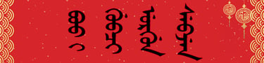
Why Does Manchu Writing on Some Qing Artifacts Look Stiff?
Discover why Manchu inscriptions on Qing artifacts sometimes look stiff or unnatural, and how engraving, seal script, restoration, and modern reproductions affect their appearance.
MING YE
10/19/202612 min read
Why Does the Manchu Writing on Some “Qing Dynasty Artifacts” Look Stiff or Unnatural?
Understanding Awkward Letterforms, Historical Engraving Techniques, Modern Reproductions, and the Difference Between Authentic Manchu Calligraphy and Decorative Imitation
By MING YE
When examining an object described as a Qing dynasty artifact, a viewer may notice that its Manchu inscription looks strangely stiff.
The letters appear rigid. Their connections seem awkward. Some strokes are unusually straight, while others seem mechanically repeated. Dots and circles may look misplaced, and the entire inscription may lack the visual rhythm associated with traditional Manchu handwriting.
This can raise an important question: if the object is genuinely from the Qing dynasty, why does its Manchu writing look so unnatural?
The answer is not always straightforward.
Stiff or awkward Manchu lettering can result from the material, production technique, formal calligraphic style, or condition of an artifact. But it can also indicate that an inscription was copied or manufactured by someone who did not understand the structure of Manchu writing.
A visually awkward inscription is therefore a reason to investigate, not automatic proof that an object is fake.
To understand the difference, we must examine how Manchu writing was produced on historical objects, what makes its letterforms appear natural, and why modern imitations sometimes reproduce the script incorrectly.
1. What Does “Stiff” Mean in Manchu Calligraphy?
The word stiff describes a visual impression rather than a precise linguistic category.
An inscription may appear stiff when its strokes are unusually rigid, its proportions are inconsistent, or its letters seem poorly connected.
Other characteristics may include excessive geometric regularity, awkward spacing, and abrupt changes in stroke direction.
However, these features should not automatically be classified as mistakes.
Some historical Manchu inscriptions were intentionally formal and geometric.
Others were carved into materials that limited the freedom of the writing instrument.
A more useful analysis distinguishes three questions:
Is the inscription linguistically correct?
Is its visual form consistent with the claimed historical style?
Is the execution appropriate to the material and production technique?
An inscription can look rigid while remaining historically and linguistically correct.
Conversely, an inscription can look fluid and attractive while containing incorrect Manchu.
2. What Makes Manchu Handwriting Look Natural?
Traditional Manchu is written vertically from top to bottom, with columns arranged from left to right.
Letters normally connect within words.
Their forms vary according to position and, in some cases, neighboring letters.
In brush-written Manchu, the writer must coordinate these structures with the movement of the writing instrument.
The resulting appearance can include variations in stroke thickness, curvature, spacing, and rhythm.
However, there is no single universally correct aesthetic style.
Historical Manchu handwriting varied according to the writer, period, purpose, and writing material.
A trained scribe preparing an official document might write differently from a calligrapher producing a ceremonial inscription.
Therefore, naturalness should be assessed relative to the relevant writing tradition rather than an idealized modern model.
3. Why Can Genuine Qing Inscriptions Look Rigid?
One important reason is the material on which the inscription was produced.
Writing with a brush on paper allows relatively fluid movement.
Carving letters into stone requires a different technique.
Engraving metal imposes different physical constraints.
Casting an inscription can produce shapes unlike those formed directly by a brush.
Painting large letters onto wood also requires adjustments in scale and stroke control.
Consequently, a genuine Qing inscription may appear rigid simply because it was not produced as freehand calligraphy.
The maker may have followed a formal model designed for durability, legibility, or visual symmetry.
The appearance of a carved inscription should not be judged solely by the standards of brush-written Manchu.
4. The Difference Between Brushwork and Engraving
Brush calligraphy and engraving are related but distinct practices.
A brush creates marks through pressure, movement, and the absorption of ink.
An engraving tool removes material.
A carved line may have a consistent width even when the original written model contained variations.
Curves may become angular.
Fine details may be simplified.
Small dots and circles may be represented by drilled or carved depressions.
The resulting inscription can appear less fluid than the original design.
This does not necessarily mean that the engraver lacked skill.
It may reflect the physical requirements of transferring writing into another medium.
When evaluating an inscription, researchers should therefore distinguish the calligraphic model from the surviving carved execution.
5. Why Does Manchu Seal Script Often Look Geometric?
Some Qing official and imperial seals used specialized Manchu seal-script forms.
These forms can differ considerably from ordinary Manchu handwriting.
During the Qianlong period, the court supported the formal classification and standardization of Manchu seal-script styles.
An important historical reference is the Qinding Qingwen Zhuanti (钦定清文篆体).
Certain formal letterforms were designed to create a structured visual arrangement within the seal.
Their appearance may be angular, symmetrical, or highly stylized.
To someone familiar only with modern textbook Manchu, these forms can look unusually stiff.
However, geometric appearance may be an intentional characteristic of the script style.
It should not automatically be interpreted as poor craftsmanship.
A suspected seal inscription must be compared with the appropriate historical seal-script tradition.
6. Can Modern Reproductions Look Too Mechanical?
Yes.
Some modern reproductions are created through digital tracing, computer-controlled engraving, casting, or other manufacturing processes.
These methods can produce highly consistent lines and repeated shapes.
A mechanically regular inscription may look different from handwritten or hand-carved examples.
However, mechanical regularity alone does not establish a modern date.
Historical craftsmen also used templates, established patterns, and carefully controlled production methods.
Likewise, modern artists can produce fluid hand-written inscriptions.
Therefore, the visual impression of mechanical execution should be treated as one clue among many.
It becomes more useful when combined with evidence from the object's materials, manufacturing techniques, and provenance.
7. Why Do Some Reproductions Have Awkward Letter Connections?
Manchu letters are not simply independent shapes placed next to one another.
Their connections form part of the writing system.
A person unfamiliar with Manchu may copy the visible outline of each letter without understanding how the forms join.
This can produce abrupt transitions.
The vertical structure may appear broken.
Letters may be separated where they should connect.
Other letters may be joined in inappropriate ways.
These errors can make an inscription appear stiff even when the individual strokes look plausible.
However, not every unusual connection is incorrect.
Historical handwriting, specialized seal script, and damage may affect the visible forms.
A proper assessment requires identifying the letters and examining their expected connections.
8. Can Incorrect Letter Proportions Make Manchu Look Unnatural?
Yes.
The proportions of Manchu letters contribute to their visual appearance.
When a reproduction maker copies an inscription without understanding its structure, individual components may be stretched or compressed inconsistently.
A letter may become unusually narrow.
A curved component may be exaggerated.
A connecting stroke may be too long or too short.
The result may look unbalanced.
However, historical calligraphy also employed deliberate variations in proportion.
Monumental lettering and decorative inscriptions could adapt the script to available space.
Therefore, unusual proportions should be compared with documented examples of the relevant object type.
The question is not whether the letters match a modern font exactly, but whether their forms are plausible within the claimed tradition.
9. Why Are Dots and Circles Important to the Overall Appearance?
Dots and circles are essential components of standard Manchu orthography.
They distinguish certain letters.
Their position can affect how a word is read.
A maker unfamiliar with Manchu may place these marks inaccurately.
Dots may appear detached from the relevant letter.
Circles may be exaggerated or omitted.
Marks may be added simply because they make the inscription look more recognizably Manchu.
Such mistakes can create both linguistic and visual problems.
However, a dot that appears displaced in a photograph may be affected by carving depth, lighting, or damage.
The researcher must distinguish an original writing error from a problem in the surviving surface or image.
10. Does Stiff Writing Mean the Person Could Not Read Manchu?
Not necessarily.
A stiff inscription does not reveal the maker's linguistic ability by itself.
A literate calligrapher may deliberately use a formal style.
A skilled engraver may reproduce a correct inscription in a rigid medium.
A less experienced writer may produce correct Manchu with awkward calligraphy.
Conversely, a visually elegant inscription may contain grammatical or spelling errors.
Therefore, handwriting quality and language proficiency must be evaluated separately.
To assess linguistic knowledge, the inscription must be transcribed and read.
To assess calligraphic execution, the letterforms and production technique must be examined.
Neither assessment can fully substitute for the other.
11. Can a Person Copy Manchu Without Understanding It?
Yes.
A maker can reproduce the appearance of an unfamiliar script by copying its visible shapes.
This is possible with Manchu, Chinese, Tibetan, Mongolian, and many other writing systems.
However, copying without linguistic knowledge creates risks.
Small details may be overlooked.
Letter connections may be misunderstood.
Words may be divided incorrectly.
The inscription may be reversed or rearranged.
If the source image is unclear, the maker may invent missing details.
The resulting text may look similar to Manchu while being difficult or impossible to read.
This possibility is particularly important when examining modern decorative reproductions.
12. What Is Pseudo-Manchu?
Pseudo-Manchu is an informal descriptive term for writing-like forms that imitate the visual appearance of Manchu without forming a valid Manchu inscription.
Such forms may contain vertical strokes, connected shapes, and scattered dots or circles.
However, the apparent letters do not combine into meaningful or linguistically plausible text.
Pseudo-Manchu can appear on decorative objects whose makers prioritize appearance over linguistic accuracy.
Nevertheless, the label should be applied cautiously.
An unfamiliar inscription might actually be traditional Mongolian.
It might use a specialized Manchu seal-script style.
It might contain a rare personal name.
It might also be damaged or incompletely preserved.
Before describing an inscription as pseudo-Manchu, researchers should attempt to identify and transcribe the visible letters.
13. Why Can Digital Tracing Make Manchu Look Awkward?
Digital tracing converts an image into a design that can be enlarged, printed, or engraved.
This process can introduce distortions.
Small curves may become straight segments.
Fine strokes may disappear.
Dots may be removed as image noise.
Connected letters may become separated.
A designer may manually adjust the shapes without understanding the script.
The final result can look unnaturally geometric or inconsistent.
However, digital tracing does not necessarily produce poor results.
When performed carefully from a reliable source and checked by someone familiar with Manchu, it can preserve an inscription accurately.
The problem is not the technology itself.
It is the loss of linguistic or graphic information during reproduction.
14. Can Incorrect Fonts Cause Stiff-Looking Manchu?
Yes.
Digital Manchu typography requires appropriate character shaping.
The script uses contextual letterforms and connections.
If a font or shaping system does not handle these correctly, the displayed writing may appear disconnected or malformed.
A designer may then convert the text into an image or manually alter the glyphs.
This can create additional problems.
However, font differences should not be confused with spelling errors.
The underlying text may be correct while the visual rendering is inaccurate.
Alternatively, the encoded letters themselves may be wrong.
For historical reproduction, both the text and its displayed form should be verified.
15. Can Qing Coins Have Stiff-Looking Manchu?
Yes.
Many Qing cash coins contain short Manchu mint inscriptions.
Their letterforms were adapted to a small metal surface.
Casting quality and wear can affect their appearance.
The inscriptions may look compressed, simplified, or irregular compared with modern printed Manchu.
For example, common mint designations include Boo Ciowan and Boo Yuwan, associated with the Board of Revenue and Board of Works mints in Beijing.
These inscriptions should be compared with documented numismatic examples rather than modern calligraphy alone.
A stiff appearance does not prove that a coin is counterfeit.
Authentication also requires examination of its type, dimensions, weight, manufacturing characteristics, and provenance.
16. Can Qing Palace Plaques Have Formal or Rigid Lettering?
Yes.
Palace plaques were architectural objects.
Their inscriptions needed to fit particular spaces and remain visually legible.
Certain plaques contained bilingual Manchu–Chinese inscriptions.
The Manchu letters could be large, carefully arranged, and formally executed.
Such writing may appear less spontaneous than ordinary handwriting.
However, a palace plaque may also have been repaired, repainted, or replaced.
The present lettering may not preserve every detail of an earlier inscription.
Therefore, an apparently stiff plaque should be evaluated through architectural history and documented visual evidence.
Its style alone cannot establish whether it is original or restored.
17. Why Might a Modern Restoration Look Different from the Original?
Restoration can alter the appearance of an inscription.
A damaged plaque may be repainted.
A missing section may be reconstructed.
An inscription may be copied from an old photograph.
A modern craftsman may reproduce historical lettering using contemporary materials or tools.
If the original model is incomplete, some details may be reconstructed inaccurately.
However, restoration does not automatically make the entire artifact inauthentic.
An original Qing object may contain later repaired components.
A historical building may display a modern replacement plaque based on an earlier design.
Researchers should distinguish the age of the underlying object from the date of the visible inscription.
18. Does Repeatedly Identical Lettering Indicate Modern Production?
It can suggest the use of a repeated template or mechanical process, but it is not conclusive.
Modern digital production can generate identical letter shapes.
However, historical workshops also used models and standardized forms.
Official inscriptions often followed established conventions.
A repeated letterform may therefore be intentional.
The more useful question is whether the repetition is consistent with the object's production method and claimed period.
For example, identical digital-looking contours combined with other evidence of modern manufacture may support a later attribution.
But repetition alone is not sufficient to establish that conclusion.
19. Can an Authentic Qing Inscription Be Poorly Written?
Yes.
Historical authenticity does not guarantee artistic excellence.
Not every Qing inscription was produced by a master calligrapher.
Objects were made for different purposes and at different levels of craftsmanship.
Some inscriptions were formal and carefully executed.
Others may have been utilitarian.
Mistakes could occur during copying, engraving, or casting.
Therefore, awkward writing is not incompatible with historical authenticity.
The relevant question is whether the inscription is plausible for the object's specific historical and production context.
An ordinary administrative object should not automatically be judged according to the standards of an imperial calligraphic commission.
20. When Does Stiff Manchu Become a Warning Sign?
A stiff appearance becomes more concerning when it is accompanied by independently verifiable inconsistencies.
Examples include:
ObservationPossible explanationWhat to examineRigid, angular strokesFormal style or engraving techniqueHistorical script and materialAwkward letter connectionsCopying mistake or unfamiliarity with ManchuActual letter structureMissing dots and circlesDamage, tracing error, or incorrect writingHigh-resolution inscriptionRepeated identical shapesTemplate-based productionManufacturing characteristicsUnreadable word-like formsPseudo-Manchu or unfamiliar scriptComplete transcriptionIncorrect official terminologyHistorical misunderstandingQing institutional recordsModern-looking typographyLater reproduction or restorationFont forms and production evidenceDifferent inscription styles on one objectMultiple production stages or later alterationSurface, wear, and provenanceLinguistically impossible inscriptionIncorrect copying or fabricationHistorical Manchu grammar and vocabulary
No single item in this table automatically establishes forgery.
The strongest concerns arise when multiple independent forms of evidence contradict the claimed attribution.
21. How Should a Researcher Evaluate Stiff-Looking Manchu?
A practical assessment should proceed systematically.
Step 1: Identify the object.
Determine whether it is a coin, seal, plaque, monument, vessel, or another artifact.
Step 2: Establish the claimed date and origin.
Record the proposed historical period and provenance.
Step 3: Identify the script.
Confirm that the inscription is Manchu rather than Mongolian or another writing system.
Step 4: Determine the calligraphic style.
Distinguish ordinary Manchu from formal or specialized seal-script forms.
Step 5: Examine the material.
Consider how carving, casting, painting, or engraving may have affected the strokes.
Step 6: Transcribe the text.
Check whether the inscription contains valid Manchu words and letter connections.
Step 7: Compare documented examples.
Use reliable museum collections and historical references.
Step 8: Look for restoration or alteration.
Determine whether the visible writing may have been added or repaired later.
Step 9: Examine physical authenticity.
Consider material composition, production methods, wear, and provenance.
Step 10: State a cautious conclusion.
Describe the inscription's unusual characteristics and explain which interpretations remain possible.
This method is more reliable than making an authenticity judgment from visual appearance alone.
22. Why Does This Matter for Manchu Cultural Heritage?
Manchu inscriptions are important historical evidence.
They preserve vocabulary, official titles, institutional names, and calligraphic traditions.
Their value extends beyond their decorative appearance.
When a reproduction copies Manchu incorrectly, it may distort historical information.
When a museum catalog misidentifies an inscription, the mistake may influence later descriptions.
When a modern restoration changes letterforms, the original writing may become harder to reconstruct.
For this reason, accurate documentation is essential.
Photographs, transcriptions, translations, and provenance records should be preserved wherever possible.
Modern calligraphers and researchers can also contribute by explaining how genuine Manchu letterforms function and how they differ across historical contexts.
However, linguistic expertise should be combined with material-culture research.
A script specialist may identify an incorrect letter, while an object specialist may determine whether that irregularity reflects production, damage, restoration, or later manufacture.
23. Why Does Manchu on Some “Qing Dynasty Artifacts” Look So Stiff?
Returning to the original question:
Manchu inscriptions on some objects described as Qing dynasty artifacts look stiff because of formal calligraphic conventions, carving or casting techniques, material limitations, restoration, or modern reproduction methods.
Some genuine Qing inscriptions were intentionally geometric or rigid.
Others may have lost their original visual qualities through wear or restoration.
Modern reproductions can appear awkward when their makers copy Manchu as a decorative pattern without understanding its connected letters, distinguishing marks, and historical writing conventions.
However, stiffness alone is not proof of forgery.
A genuine artifact may contain awkward writing.
A modern reproduction may contain elegant and accurate Manchu.
The most meaningful evidence comes from examining whether the inscription is linguistically valid, historically appropriate, and consistent with the object's materials and production history.
The central distinction is between a script that is deliberately formal and one that is incorrectly constructed.
The first may be a legitimate historical style.
The second may reveal a copying problem, an inaccurate restoration, or a questionable attribution.
Only careful linguistic and material analysis can establish which explanation is supported by the evidence.
— MING YE
References and Research Materials
Manwen Laodang (满文老档, Old Manchu Archives). Early Manchu historical records relevant to the development of written Manchu and historical letterforms.
Qinding Qingwen Zhuanti (钦定清文篆体, Imperially Commissioned Manchu Seal-Script Forms). A Qing imperial reference concerning specialized Manchu seal-script styles.
Yuzhi Qingwen Jian (御制清文鉴, Imperially Commissioned Mirror of the Manchu Language). An important historical reference for Manchu vocabulary and orthography.
Da Qing Huidian (大清会典, Collected Statutes of the Great Qing). A primary source for Qing institutional terminology and administrative conventions.
The Palace Museum, Beijing. Qing imperial seals, palace plaques, inscriptions, and documented historical artifacts.
National Palace Museum, Taipei. Qing manuscripts, imperial objects, seals, and historical inscriptions.
First Historical Archives of China. Qing Manchu-language archival documents and manuscripts.
Gertraude Roth Li, Manchu: A Textbook for Reading Documents (2000). A reference for Manchu orthography, grammar, and historical document reading.
Jerry Norman, A Comprehensive Manchu-English Dictionary (2013). A major reference for Manchu vocabulary and historical terminology.
Mark C. Elliott, The Manchu Way: The Eight Banners and Ethnic Identity in Late Imperial China (2001). A study of Manchu identity and Qing institutional history.
Evelyn S. Rawski, The Last Emperors: A Social History of Qing Imperial Institutions (1998). A study of Qing imperial institutions and material culture.
Unicode Consortium, Unicode Standard, Mongolian Script. Technical documentation relevant to the digital representation of Manchu characters and contextual letterforms.