Why Does Manchu Calligraphy Look So Decorative?
Why is Manchu calligraphy so decorative? Explore its flowing vertical letters, dots, circles, brushwork, Qing inscriptions, and distinctive artistic beauty.
MING YE
11/12/202610 min read
Why Does Manchu Calligraphy Look So Decorative?
The Visual Beauty of Connected Letters, Vertical Composition, Rhythmic Strokes, and the Artistic Structure of the Manchu Script
By MING YE
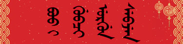
Why does Manchu calligraphy often look so decorative, even to people who cannot read a single Manchu word?
At first glance, the script may appear to consist of elegant vertical lines, flowing curves, delicate dots, and carefully balanced ornamental shapes. Some viewers compare it to hanging ribbons, intricate patterns, or abstract graphic design.
Yet these visual qualities are not simply decorations added by an artist.
Much of the decorative appearance of Manchu calligraphy comes directly from the structural characteristics of the Manchu writing system itself.
Traditional Manchu is written vertically, with letters connected within words. Its letterforms change according to their position, and certain sounds are distinguished through small graphical features, including dots and circles.
When these elements are executed with a brush or another expressive writing instrument, they can create strong visual rhythms.
The arrangement of long and short words, the movement of connecting strokes, and the spaces between vertical columns contribute to the overall composition.
Historical Manchu writing also developed within the visual culture of the Qing dynasty, where multilingual inscriptions, formal manuscripts, and imperial decorative arts gave the script a prominent public presence.
Contemporary calligraphers can build upon these characteristics through variations in stroke weight, scale, spacing, and composition.
To understand why Manchu calligraphy looks decorative, it is useful to examine the relationship between the script's linguistic structure and its artistic possibilities.
1. The Manchu Script Has a Naturally Flowing Structure
One of the most important reasons Manchu calligraphy appears decorative is the connected structure of its letters.
Manchu is an alphabetic writing system derived from traditional Mongolian writing.
Unlike ordinary printed English, where letters are often visually separated, traditional Manchu letters connect within words.
This creates continuous written forms.
A single word may appear as an extended vertical sequence rather than a collection of independent symbols.
The visual result can resemble a flowing ornamental line.
However, these connections are part of the writing system.
They are not arbitrary embellishments.
Each letter contributes to the spelling of a word, and its form is influenced by its position.
For example, a letter appearing at the beginning of a word may differ from its form in the middle or at the end.
The transitions between these forms help create the characteristic appearance of Manchu writing.
When written with artistic control, these connections can produce a sense of continuity and movement.
The eye follows the written structure downward, encountering changes in direction, curvature, and stroke thickness.
This creates an effect that may seem decorative even when the writing is entirely conventional.
The flowing appearance of Manchu calligraphy begins with the alphabet itself: connected letters create visual continuity before any additional artistic stylization is introduced.
2. Vertical Writing Creates a Strong Decorative Rhythm
Traditional Manchu is written from top to bottom, with columns arranged from left to right.
This vertical organization has a major influence on its visual appearance.
Many viewers are accustomed to horizontal writing, particularly in English and modern Chinese typography.
Manchu therefore presents a different visual experience.
Its words extend downward, producing elongated forms that can resemble suspended ornaments or patterned vertical bands.
The direction of the script also influences how a calligrapher organizes a composition.
Rather than arranging letters across a horizontal line, the artist works with vertical sequences.
The visual rhythm develops through the progression of letters and words down the page.
Longer words create extended structures.
Shorter words produce more compact forms.
These differences affect the spacing and balance of the composition.
When multiple columns are arranged together, their repeated vertical direction can create a strong sense of order.
At the same time, differences between individual words introduce variation.
The combination of repetition and variation is a fundamental source of visual rhythm.
This is comparable to architectural ornament, where repeated structural elements can create decorative effects without being purely ornamental.
In Manchu calligraphy, the writing direction itself contributes to the artistic composition.
Vertical organization gives Manchu calligraphy a distinctive rhythm that can appear both orderly and expressive.
3. Dots, Circles, and Small Letter Details Add Visual Complexity
Another reason Manchu writing appears decorative is the presence of small graphical details within its letterforms.
The Manchu script underwent an important reform in 1632, traditionally associated with Dahai.
This reform introduced or systematized distinctions involving dots and circles to help differentiate certain letters and sounds.
These features improved the writing system's ability to represent the language.
They also contributed to its distinctive visual appearance.
To someone unfamiliar with Manchu, the dots and circles may resemble decorative accents.
However, they often have an essential orthographic function.
They help distinguish letters that would otherwise be difficult to identify.
A calligrapher must therefore preserve them accurately.
Their size, placement, and relationship to surrounding strokes can influence the visual balance of a word.
For example, a small dot may create a point of emphasis within a long vertical sequence.
A circle may introduce a contrasting rounded element among more linear strokes.
When several such features appear within a composition, they contribute to a complex visual texture.
However, artistic treatment should not compromise their linguistic function.
Making a dot excessively large, omitting it, or placing it incorrectly may change the intended letter.
The small details that make Manchu writing look ornamental are often essential parts of its spelling system, demonstrating how linguistic accuracy and visual beauty can coexist.
4. Manchu Words Create Different Visual Shapes and Lengths
Manchu calligraphy is also distinctive because words can vary considerably in their visual length.
Since letters connect vertically, the number and structure of letters influence the physical appearance of a word.
A short word may occupy a relatively compact space.
A longer word may extend substantially farther down the page.
Grammatical endings can also increase the length of written forms.
Manchu is generally described as an agglutinative language, meaning that grammatical information is often expressed through suffixes.
This linguistic characteristic can influence the appearance of written words.
However, not every grammatical marker is necessarily written as part of one uninterrupted orthographic word.
The important artistic point is that different linguistic structures produce different visual forms.
A composition containing words of varied lengths may have an irregular but potentially harmonious rhythm.
The calligrapher must consider how these forms interact.
For example, placing several long written sequences close together may create visual density.
Shorter sequences can introduce contrast and additional space.
The artist may adjust column spacing, overall scale, and placement to achieve balance.
These decisions are artistic, but they must respect the correct spelling and structure of the text.
This makes Manchu calligraphy particularly interesting as a relationship between language and design.
The varying lengths and structures of Manchu words provide natural opportunities for visual contrast and compositional balance.
5. Brushwork Can Transform Ordinary Writing into Expressive Art
The decorative appearance of Manchu calligraphy becomes more pronounced when the script is executed with expressive brushwork.
Traditional East Asian brushes allow artists to vary line thickness through pressure, movement, angle, and speed.
These techniques can be adapted to Manchu writing.
A thin connecting stroke may contrast with a broader curved element.
A controlled change in pressure can create a sense of movement.
Variations in ink density may add texture and depth.
However, the brushwork must accommodate the script's structural requirements.
Manchu letters are connected, and some distinctions depend on relatively small graphical details.
Excessive ink spreading can obscure these features.
Likewise, overly dramatic changes in stroke thickness may make certain letters difficult to recognize.
A skilled calligrapher therefore balances expressive freedom with legibility.
The artistic challenge differs from simply copying an alphabet chart.
Ordinary handwriting aims primarily to record language clearly.
Calligraphy also considers the aesthetic qualities of the written form.
These include stroke rhythm, proportion, movement, spacing, and overall composition.
The same correctly spelled Manchu phrase may be written in several visually different ways.
One version may emphasize precision and restraint.
Another may emphasize dynamic brush movement.
A third may use broader strokes and a more monumental composition.
Each approach can produce a different artistic effect while preserving the same linguistic content.
Brushwork enhances the decorative potential of Manchu writing by introducing expressive variation into its already distinctive connected structure.
6. Why Does Manchu Calligraphy Sometimes Resemble Ornamental Design?
To viewers unfamiliar with the language, Manchu calligraphy can resemble abstract or ornamental design.
This reaction is partly related to the way people perceive unfamiliar writing systems.
When someone reads a familiar script, attention is often directed toward meaning.
An English reader encountering an English sentence may recognize its words almost automatically.
The letters become a pathway to understanding the message.
When the same reader encounters an unfamiliar script, that automatic process is absent.
Attention shifts toward visual features.
The viewer notices lines, curves, repetition, spacing, and overall composition.
Manchu writing is particularly effective at producing this response because of its vertical orientation and connected forms.
Its letters may appear as a continuous pattern rather than as separate linguistic units.
The resulting visual impression can resemble textile ornament, architectural decoration, or abstract line art.
However, this resemblance should not lead to the assumption that the writing is merely decorative.
A Manchu inscription may contain a precise historical statement, personal name, official title, or literary expression.
Its meaning remains important even when the viewer cannot read it.
This creates two simultaneous levels of appreciation.
A reader familiar with Manchu may understand both the written content and the artistic execution.
A viewer unfamiliar with the language may initially appreciate its visual structure.
The decorative appearance of Manchu calligraphy is partly a result of its distinctive forms and partly a result of how unfamiliar writing is perceived by the viewer.
7. Qing Dynasty Inscriptions Helped Establish Its Formal Visual Identity
The historical use of Manchu writing also contributes to its decorative associations.
During the Qing dynasty, Manchu appeared in imperial documents, administrative records, official plaques, monuments, and multilingual inscriptions.
The Qing court maintained the language as an important component of imperial institutions and identity.
Manchu writing therefore appeared in settings where visual presentation carried political and ceremonial significance.
Bilingual Manchu-Chinese inscriptions are particularly important examples.
Such inscriptions demonstrate how two different writing systems could be arranged within a shared architectural or commemorative composition.
The visual contrast between Chinese characters and connected Manchu letters could be striking.
Chinese characters generally form compact graphic units.
Manchu writing produces elongated connected sequences.
When placed together, the two scripts create a distinctive visual relationship.
Formal plaques and inscriptions also introduced Manchu writing into architectural environments.
The script could become part of a building's visual identity while retaining its linguistic meaning.
However, the presence of Manchu writing on an imperial object does not automatically make it an independent work of calligraphic art.
Many inscriptions served administrative, commemorative, or ceremonial functions.
Their decorative impact arose from the combination of writing, material, placement, and historical context.
Qing imperial inscriptions helped establish Manchu writing as a visually recognizable element of formal architecture and ceremonial culture.
8. Stylized Manchu and Seal-Script Art Can Increase the Decorative Effect
Contemporary artists can further develop the decorative qualities of Manchu through stylized writing.
Some approaches emphasize geometric structure.
Others explore symmetry, elongated proportions, or variations in stroke movement.
Manchu seal-script traditions and modern seal-script-inspired adaptations are particularly relevant to this discussion.
Historically documented ornamental Manchu forms should be distinguished from contemporary artistic reinterpretations.
The Qing court's interest in formal and decorative scripts provides an important historical context, but individual styles must be identified through appropriate historical evidence.
A modern artist may develop geometric compositions inspired by the structural features of Manchu writing.
Such work can emphasize the relationship between letters, repeated forms, and visual balance.
However, artistic stylization creates an additional responsibility.
The underlying writing system must remain accurate when the work is presented as readable Manchu.
Essential letter distinctions should be preserved.
Word spelling should be checked.
The artist should also understand whether a particular design represents a historically documented form or a modern invention.
This distinction matters for museums, scholarly publications, and cultural education.
It allows viewers to appreciate artistic innovation without confusing it with historical evidence.
Decorative experimentation can be valuable when it is grounded in a genuine understanding of the script.
Stylized Manchu calligraphy can expand the visual possibilities of the writing system, but historical accuracy and orthographic integrity remain essential.
9. How Can Artists Preserve Readability While Creating Decorative Effects?
One of the central challenges of Manchu calligraphy is maintaining a balance between artistic expression and linguistic clarity.
Because the script already has a complex connected structure, excessive ornamentation can make it difficult to read.
This problem may arise when strokes are exaggerated, letter connections are altered, or small identifying details are obscured.
A successful calligraphic work should therefore begin with accurate writing.
The artist must understand the spelling of the chosen text.
The positional forms of the letters should be correct.
Connections should follow the structural requirements of the script.
Only then should additional artistic variation be introduced.
Several principles are particularly useful.
Structural accuracy: Essential letterforms and distinctions must remain identifiable.
Controlled variation: Changes in stroke thickness and movement should support rather than disrupt the written structure.
Balanced spacing: Words and columns should be arranged to maintain visual clarity.
Appropriate materials: Brushes, ink, and paper should allow important details to remain visible.
Meaningful composition: The artistic arrangement should complement the content of the text.
These principles are relevant to both traditional brush calligraphy and contemporary artistic experimentation.
They also help distinguish genuine calligraphy from designs that merely imitate the appearance of Manchu letters.
A decorative pattern inspired by Manchu may be visually attractive.
However, if it does not contain correctly formed words, it should not be presented as an accurate example of Manchu writing.
The strongest Manchu calligraphy does not sacrifice readability for decoration; it develops visual beauty through a disciplined understanding of the script.
Conclusion: Why Is Manchu Calligraphy So Visually Decorative?
Manchu calligraphy appears highly decorative because the writing system itself combines vertical movement, connected letters, distinctive graphical details, and varied word structures.
These characteristics create visual rhythm even before artistic stylization is introduced.
The traditional vertical arrangement produces elongated compositions.
Connected letterforms create flowing lines.
Dots, circles, and positional variations add visual complexity.
Differences in word length contribute to contrast and balance.
When executed with expressive brushwork, these structural features can become even more visually striking.
Historical Qing inscriptions and formal manuscripts also contributed to the script's association with ceremonial and architectural presentation.
Contemporary calligraphers can build upon this heritage through new compositions, materials, and artistic interpretations.
However, the decorative appearance of Manchu writing should not obscure its primary identity as a functional writing system.
Its letters represent language.
Its graphical distinctions carry linguistic information.
Its words convey meaning.
The artistic possibilities of Manchu calligraphy arise precisely from this relationship between structure and expression.
The distinctive beauty of Manchu calligraphy is that its decorative qualities are not merely added to the writing—they emerge naturally from the way the script is constructed.
This makes Manchu calligraphy a compelling form of visual art, capable of connecting linguistic heritage, historical tradition, and contemporary creativity.
— MING YE
References and Research Materials
Linguistic and Historical Studies
Gertraude Roth Li, Manchu: A Textbook for Reading Documents (2000).
Jerry Norman, A Comprehensive Manchu-English Dictionary (2013).
Liliya M. Gorelova, Manchu Grammar (2002).
Mark C. Elliott, The Manchu Way: The Eight Banners and Ethnic Identity in Late Imperial China (2001).
Pamela Kyle Crossley, A Translucent Mirror: History and Identity in Qing Imperial Ideology (1999).
Evelyn S. Rawski, The Last Emperors: A Social History of Qing Imperial Institutions (1998).
Juha Janhunen, Manchuria: An Ethnic History (1996).
Primary Historical Sources
Manwen Laodang (满文老档, Old Manchu Archives).
Yuzhi Qingwen Jian (御制清文鉴, Imperially Commissioned Mirror of the Manchu Language).
Qing Taizong Shilu (清太宗实录, Veritable Records of Qing Taizong).
Qing-period Manchu-Chinese bilingual inscriptions, imperial plaques, and archival manuscripts.
Museum and Research Collections
The Palace Museum, Beijing. Qing imperial inscriptions, plaques, manuscripts, and material culture.
National Palace Museum, Taipei. Qing court manuscripts and multilingual historical collections.
First Historical Archives of China. Historical Manchu manuscripts and administrative documents.
Unicode Consortium. The Unicode Standard, Mongolian script documentation relevant to Manchu letterforms and digital rendering.
Research note: The decorative appearance of Manchu writing can be examined through its documented orthographic structure and surviving historical artifacts. Interpretations involving visual rhythm, ornament, and contemporary artistic potential are aesthetic analyses rather than fixed linguistic classifications.